Logo Design
Brand Identity Manual Snippets
Logo Rationale
Red is the color of energy, passion and action. Red is a warm and positive color associated with our most physical needs and our will to survive. It exudes a strong and powerful masculine energy.
It is energizing, excites the emotions and motivates us to take action. It signifies a pioneering spirit and leadership qualities which is what the brand stands for.
The bold typography very vividly communicates boldness, transparency and confidence in the business.
The fire represents the burning passion for excellence. The font is tilted to the right to denote speed and action
![]()
Taking “X” as the height of the character ‘S’ in the logo type, the exclusion zone would be the area defined by leaving a uniform margin “X” units on all four sides.
Enquiry Now
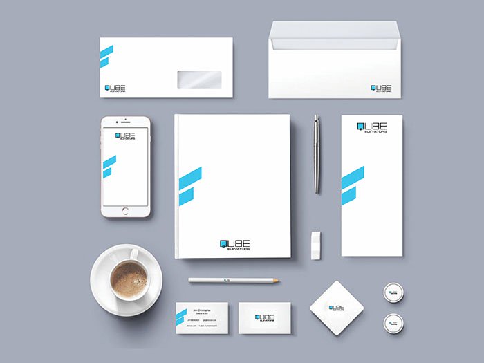
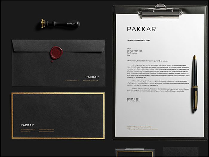
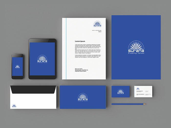
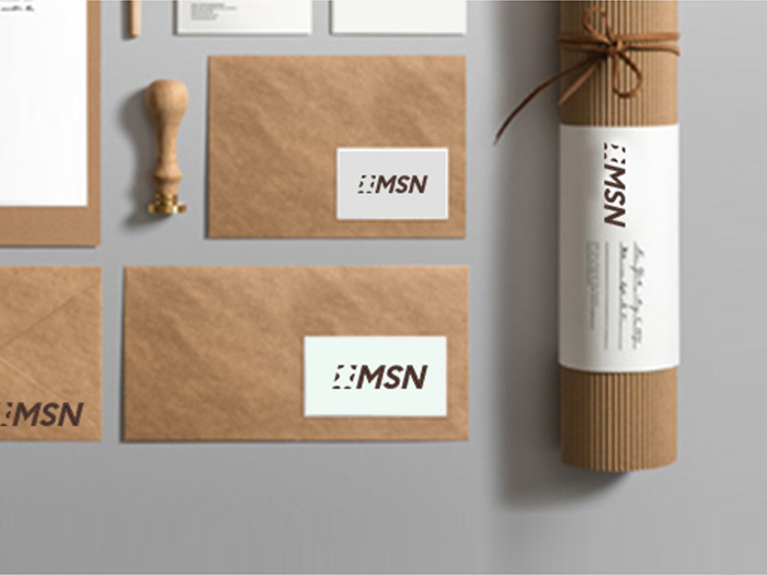
Implementing the brand colors across media
![]()
Logo Version
![]()
Logo in Reverse
![]()
Premitted reverse version of the logo
The logo can be reversed out of either Black of 90% Gray or White on Gray (Original color of Logo). It should not be reversed out of an any other color. The sequence of colors should not be modified in any manner.
Typical Applications
External signage, environmental graphics, advertisements etc.
Scaling the logo
![]()
Our Mark up Works

The philosophy and the strong value system of a brand is conveyed through branding which builds trust and confidence with its employees, business partners and customers.
INDIA
Spencer Plaza , G182, Phase- III, Anna Salai, Chennai, Tamil Nadu 600002
UAE
P. O. Box: 25218, S7, Cluttons Ware House, Industrial Area 15, Sharjah, United Arab Emirates.
\